Secondary Visual Art
Secondary visual arts students have nearly completed their first unit of work. They must be commended for their continued innovation and for working with materials that they have access to in their home environment. Here are some of the pieces of artwork they have created.
The Grade 6 students have been taught about Aesthetics, in their unit ‘Space in the Everyday’, where they explored how the element of space can be used as negative and positive and how it can be manipulated. The Grade 7 students investigated their Identity, in their unit ‘A Different View of Me’, where they learned about portraiture and how it can be representational or symbolic. The Grade 10 students also explored Identity, in their unit ‘Drama in the everyday’, however they analysed how social constructs of identity can be formed through narratives.
Artwork No. 1
Title: Natural explosion
Artist: Aarez Uzair Hassan
Dimension: A4
Media: Purple paper, glue, pencil, and A4 paper.
Date: 2020
The meaning is that I like natural made things. What inspired me is the natural things and I like all the colors on naturally made things like in rainbows there are many beautiful colors. I really like naturally made things so I made a rainbow, leaf, and an eagle. The elements of art I used are space and line because in Notan design you need to have spacing. The technique I used was I cut a 4x4x4x4 inch paper then drew my designs, spaced them out, then I cut my designs and stuck them on my Arts Process Journal.
Artwork No. 2
Title: The White Magic
Artist: Syed Afraz Rizvi
Dimension: 11.9 x 8.5 inches
Media: Collage-White paper and a big green paper
Date: 2020
I wanted this artwork to be crazy and I want it to be many different designs. The colours do not mean anything. I chose white over green because it stands out and I did not want to do white and black that would look too plain. I used colour, line and texture. I used different colours, line because in the artwork you can see different types of lines and texture because there is many different textures in my Notan Design.
Artwork No. 3
Title: Untitled
Artist: Aryana Malik
Media: Collage colored papers, glue, scissor,
Dimension: 30 x 30 cm
Date: 2020
The elements of art that I used are shapes and colours. There are a lot of shapes. There are two colours: white and purple. The white represents positive space and which reminds me of brightness and the purple represents negative space and which reminds me of darkness. When the both of them collide, I think that there is a dark and bright side to everything and every one.
Artwork No. 4
Title: Untitled
Artist: Farhaz Kawser
Dimension: 8.3 x 11.7 inches
Media: Blue color paper, pencil
Date: 2020
I cut advanced shapes and turned it into a Notan Design. The notan design has multiple different types of positive and negatives spaces.
Artwork No. 5
Title: “Is That Me?”
Artist: Shamsunnahar Binte Mohiuddin (Masuma)
Dimension: 21.0 x 29.7 cm
Media: Pencil on Paper
Date: 2020
This is my pencil portrait which I created using different pencil shades. I got inspired by many hatching portraits which then inspired me to try out the hatching technique and that is the technique I have used in this portrait. I looked at my own picture as reference to create this self-portrait. Focusing on a specific area where the light fell, I have added shades and hatching techniques accordingly. Every stroke in my artwork is a symbol representing myself and my personality. After many improvements and adjustments, I am finally proud to call this my final piece of my self-portrait! The title of my artwork is a reaction of mine, after I completed my artwork!
Artwork No. 6
Title: The Girl Who Cries Blood
Artist: Maysoon Sarah
Dimension: 60 x 60 cm
Media: Pencil and paper
Date: 2020
The story is about a mysterious princess of a parallel universe where she has some supernatural powers. One of them is to heal an injured person by dropping her tears on the injured area. The tears are magical, so they appear bright red when it comes out of her eyes. The black and white color symbolizes the mysterious and dark aura that represents her fate. The red color of the tears is the magical blood coming out of her eyes. I used crayon and pencil for this.
Artwork No. 7
Title: Black and White Me!
Artist: Aditya Varshney
Dimension: 37 x 27 cm
Media: Pencil portraiture, pencil shading.
Date: 2020
The meaning of this artwork is how two different things can fit together. Some rubbed shading and some line shading (The comparison between the hair and the face. You can see that the hair has perfect lines, but on the face, the shading is merged together). I used Pencil shading mainly. Some techniques I used are stippling, hatching and cross hatching. Some art elements I used are texture, line and color. Positive things I like about this artwork are how realistic it looks, the details I put in, and the effort put in it. Some areas I could improve are the eyebrows, and the neck.
Artwork No. 8
Title: “That’s me!”
Artist: Alvira Khan
Dimension: 19.2 x 17.5 cm
Media: Pencil portrait on paper
Date: 2020
This artwork is a pencil portrait. I got inspired by a few random images and I created this artwork, by following a picture of my own. I have used techniques like back and forth stroke to create this effect. There are many shades here and I did that by using different pencils, creating lighting effects. I think I did a good job drawing and shading my neck but could improve my shading techniques around my face and hair.
Artwork No. 9
Title: Just a Normal Girl
Artist: Kazi Tamazer Anzaleen
Dimension: 29 x 20 cm
Media: Pencil on paper
Date: 2020
The meaning behind the artwork is the title, just a normal girl. Her life is like a normal girl, she goes to school, has an amazing family, she has friends that care for her, she fights with her sibling, and everything else a normal girl does. To make the outlines of the artwork, it was made with a pencil and a ruler and it used different shading pencils for the shading. The artwork uses the colors black and white.
Artwork No. 10
Title: Struggle To Success
Artist: Arwa Hanif
Dimension: A3
Media:Felt tips and Acrylic
Date: 2020
My artwork is about a person who had COVID 19 and recovered from it, through my artwork i am trying to show his physical and mental transformation from coronavirus to a full healthy person.The meaning of my artwork is, a boy struggled through many difficulties during his COVID journey, and then after getting a proper treatment and care he fully recovered. It shows how he changed in two different stages. As nowadays we can see many people are becoming hopeless when they get affected by coronavirus, and they think that they won’t get better anymore, they won’t recover from it anymore, so it inspired me to do this artwork and make all of those people feel and understand that you should not be hopeless in any situation. As you can see on the first part of my artwork it is showing the journey during his coronavirus, it shows that the lungs are very weak and sick, the temperature on the thermometer is very high, mandatory to wear mask, a sign of coronavirus, he had to take several kinds of high power medicines. On the second part of my artwork it is showing that he finally recovered from his painful journey, and you can also see there is a flag where it is written “Road To Recovery”, a heart with the word “HEALED” a medicine box with a cross sign which shows no medicine anymore and a healthy and happy lungs. There are also some stairs with each step of his fight with coronavirus, first he got affected by COVID – 19, will power, medical team, treatment, lastly and happily Recovery and Success. In the first part of my artwork I colored the symbols and objects a bit darker to express his darkness, roughness and sadness. On the second part of my artworks I colored it with light and bright colors to express his recovery, success and healthy life. As you can see the stairs, there are three different colors showing three of the changes of his journey from COVID to Recovery. The arrows are showing the transformation on his two completely different journeys. The media i have used is felt tips and acrylic. To trace the objects and symbols and to color them I used felt tips. I used acyclic to color the background of my artwork. The elements that I have used in my artwork are, color, shape and value, the media techniques that I used, I tried to use a thin brush to paint with acrylic, I took enough time to paint and not rush to finish. To sketch the symbols and objects I used pencil very lightly so that it stays clean and when I erase it to fix something it will be easy for me to do. To color it with felt tips i used the thin felt tips on some areas so that the color wont get out. However, through my artwork I wanted to show that, people who are becoming hopeless to get cured of their sickness, they shouldn’t do that.They must keep in their mind that there are many people who are recovering from their struggles, and getting back to a healthy life.
Artwork No. 11
Title: A Mother’s Soul filled with Hope.
Artist: Chandrima Barua
Dimension: A3
Media: Mixed media:-Oil Pastels,Pencil Color
Date: 2020
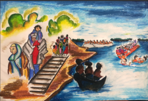
The artwork I created is about a Syrian family, especially a Syrian mother who fled Syria to save their children’s lives.The mother wants to hold on to their family but at the same time if she has to leave her children, she will do so for the survival of her children.
Artwork No. 12
Title: Joakim’s Covid Narrative
Artist: Cianna Crasto
Dimension: 11.7 x 16.5 inches
Media: Mixed Media- watercolor and acrylic paint
Date: 2020
The artwork represents a boy named Joakim and his story during Covid. It expresses the activities he desires like playing treasure hunt. Symbols used to convey his story is the unique attire like the bandana and the map help address what he does and his personality. Mixed media techniques such as watercolour and acrylic paint are used. Watercolour is used for the background as it is easy to overlap over thus making the focal point of the artwork stand out. The artwork contains colour and space as these elements helps bring unity among the artwork.
Artwork No. 13
Title: Future in the Sky
Artist: Kashfe Kumkum
Media: Digital Art – Procreate
Date: 2020
This artwork is Bodoor’s life, her dreams, her future, her family. I wanted to show her hope in the artwork, with the stars representing her dreams of becoming the first Syrian woman to ever go to space. You can see the UNICEF flag, showing her past, you can see her family which is her present, I wanted to show the struggle, I specifically used digital art to show the sharpness of the artwork. I have a smooth texture to bring more peace within the artwork itself.
Artwork No. 14
Title: “The First Step”
Artist: Ragib Noor
Dimension: 11.7 x 16.5 inches (A3)
Media: Alcohol Based Markers, Poster Colors
Date: 2020
Badoor, a Syrian refugee who came to Jordan for safety and also with a big dream to be the first Syrian to go to space. So as the title of my artwork projects.”The First Step” based on that story of Badoor I have got my inspiration which led me to create this artwork.


